Live.log_plot()
def log_plot(
    name: str,
    datapoints: pd.DataFrame | np.ndarray | List[Dict],
    x: str,
    y: Union[str, list[str]],
    template: Optional[str] = None,
    title: Optional[str] = None,
    x_label: Optional[str] = None,
    y_label: Optional[str] = None,
):
Usage
from dvclive import Live
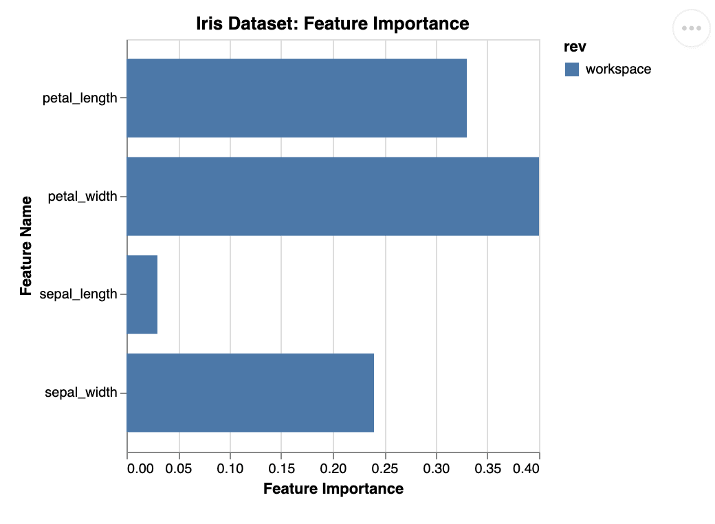
datapoints = [
{"name": "petal_width", "importance": 0.4},
{"name": "petal_length", "importance": 0.33},
{"name": "sepal_width", "importance": 0.24},
{"name": "sepal_length", "importance": 0.03}
]
with Live() as live:
live.log_plot(
"iris_feature_importance",
datapoints,
x="importance",
y="name",
template="bar_horizontal",
title="Iris Dataset: Feature Importance",
y_label="Feature Name",
x_label="Feature Importance"
)Description
The method will dump the provided datapoints to
{Live.dir}/plots/custom/{name}.json and store the provided properties to be
included in the plots section written by Live.make_dvcyaml().
The example snippet would produce the following dvc.yaml:
plots:
  - dvclive/plots/custom/iris_feature_importance.json:
      template: bar_horizontal
      x: importance
      y: name
      title: 'Iris Dataset: Feature Importance'
      x_label: Feature Importance
      y_label: Feature Name
The plot can be rendered with DVC CLI, VSCode Extension or DVC Studio.
Parameters
-
name- name of the output file. -
datapoints- Pandas DataFrame, Numpy array or list of dictionaries containing the data for the plot. -
x- name of the key (present in the dictionaries) to use as thexaxis. -
y- name of the key or keys (present in the dictionaries) to use as theyaxis. -
template- name of the DVC plots template to use. Defaults tolinear. -
title- title to be displayed. Defaults to{Live.dir}/plots/custom/{name}.json. -
x_label- label for thexaxis. Defaults to the name passed asx. -
y_label- label for theyaxis. Defaults to the name passed asy.
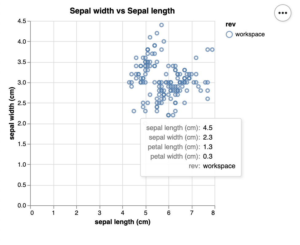
Example: Plot from Pandas DataFrame
You can plot data from the Pandas DataFrame format:
import pandas as pd
from dvclive import Live
from sklearn.datasets import load_iris

iris = load_iris()
datapoints = pd.DataFrame(data=iris.data, columns=iris.feature_names)

with Live() as live:
    live.log_plot(
        "sepal",
        datapoints,
        x="sepal length (cm)",
        y="sepal width (cm)",
        template="scatter",
        title="Sepal width vs Sepal length")
The example snippet would produce the following dvc.yaml:
plots:
  - dvclive/plots/custom/sepal.json:
      template: scatter
      x: sepal length (cm)
      y: sepal width (cm)
      title: Sepal width vs Sepal length
Rendered plot:
Example: Plot from Numpy Array
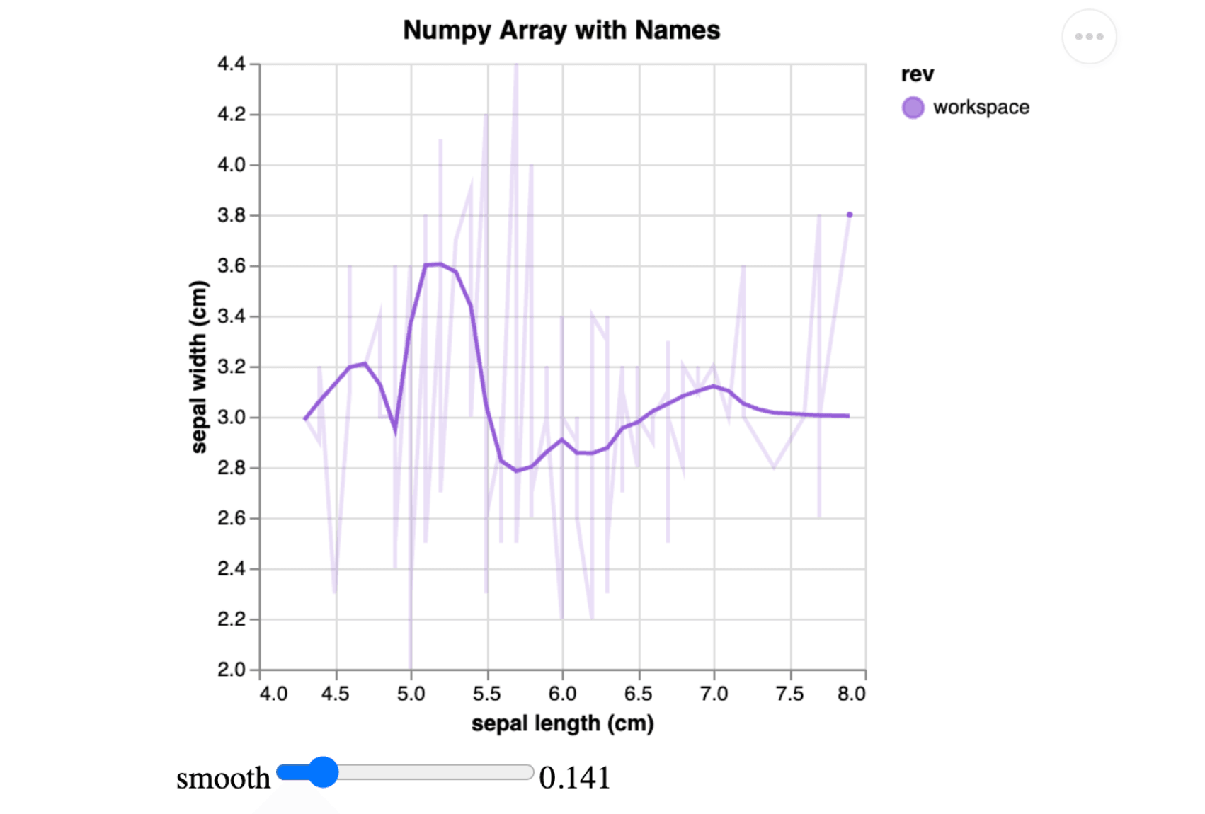
DVCLive supports both structured Numpy arrays with named columns for descriptive data visualization and unstructured arrays for straightforward numerical plotting.
Example with Structured Numpy Array
In this example, the Iris dataset is loaded and then converted into a structured Numpy Array. Each column name corresponds to a feature of the Iris dataset.
import numpy as np
from dvclive import Live
from sklearn.datasets import load_iris

# Create a structured array
iris = load_iris()
dtypes = [(name, float) for name in iris.feature_names]
data = np.array([tuple(row) for row in iris.data], dtype=dtypes)

with Live() as live:

    live.log_plot(
        "sepal_array_named",
        data,
        x="sepal length (cm)",
        y="sepal width (cm)",
        template="smooth",
        title="Numpy Array with Names"
    )
The log_plot() method creates a smooth plot. Labels for Xand Yare
extracted from column names automatically.
The example snippet would produce the following dvc.yaml:
plots:
  - dvclive/plots/custom/sepal_array_named.json:
      template: smooth
      x: sepal length (cm)
      y: sepal width (cm)
      title: Numpy Array with Names
Rendered plot:
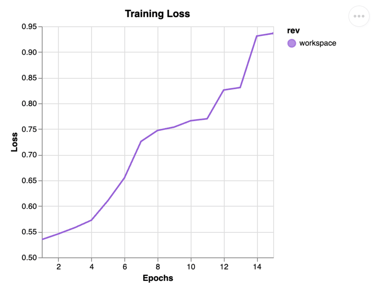
Example: Plot from Unstructured Numpy Array
This example visualizes training loss over epochs using a two-column array without named columns. In unstructured arrays like this, DVCLive numerically indexes the columns, such as "0", "1", and so on.
import numpy as np
from dvclive import Live

# Create an unstructured array
epochs = np.arange(1, 16)
values = np.sort(np.random.uniform(0.45, 0.965, 15))
data = np.column_stack((epochs, values))

with Live() as live:
    live.log_plot(
        "training_loss_plot",
        data,
        x="0",
        y="1",
        template="linear",
        title="Training Loss",
        x_label="Epochs",
        y_label="Loss"
    )
The log_plot() method generates a linear plot titled "Training Loss", utilizing the provided labels to name the x-axis and y-axis.
The example snippet would produce the following dvc.yaml:
plots:
  - dvclive/plots/custom/training_loss_plot.json:
      template: linear
      x: '0'
      y: '1'
      title: Training Loss
      x_label: Epochs
      y_label: Loss
Rendered with dvc plots:
Exceptions
-
dvclive.error.InvalidDataTypeError- thrown if the provideddatapointsdoes not have a supported type. Supported types include:pd.DataFrame | np.ndarray | List[Dict]